Communicating a complex museum and gallery offering to online users: a new website for Henry Moore Foundation

Our friends at Henry Moore Foundation (HMF) tasked us with creating a new website that better reflected both their complex offering and identity as an organisation. HMF consists of two physical sites - a contemporary gallery at the Institute in Leeds (which is also a Centre for sculptural study) and the Studios and Gardens in Hertfordshire which houses the Henry Moore collection - in addition to hosting online events and an international programme of touring exhibitions.
Their new site needed to do two main things:
- Make this hybrid offer easy to understand by giving more clarity over what visitors could expect from both physical sites, along with dedicated places for users to explore their online and international programmes.
- Drive deeper audience engagement with HMF’s extensive collection, library catalogue and archives:
“In support of our audience development plans, we need to provide better access to our collections and more engaging content about what the Henry Moore Foundation does, to encourage people to visit and broaden our reach.” - from the invitation to tender.
The project also involved us styling HMF’s new Shopify platform to align with their brand and ensure a cohesive feel between the main site and Shopify, that would increase online retail and funding opportunities.
“We faced a lot of challenges - we're a complex, multi-venue organisation, with additional focuses on sculpture research, engagement and grant-giving. The requirements set out at the start of the project were (and are) extensive - it was clear that the new site would have a lot of work to do to communicate our varied messages effectively.”
Emily Dodgson, Head of Marketing and Communications at HMF.
Ingredients for success
To get this right, we needed to consider a few key things:
- Information architecture - content on the legacy site was organised from an internal departmental perspective, so a big part of the discovery phase was understanding what was important to users so that we could design an information architecture that met user needs and expectations.
- Visual identity - we needed to make better use of their pre-existing visual identity to make it more engaging for online users. HMF weren’t rebranding but they wanted the new site to have a more contemporary look and feel, while retaining key design devices from their existing brand.
- Integrations -
- HMF were in the process of transitioning to GoodCRM to process donations and memberships, but still needed to ticket certain events externally via ArtTickets and Eventbrite.
- The digital representation of their collection is delivered via an external third party platform called eMuseum (from Gallery Systems), so we needed to figure out how best to cross-pollinate the marketing site’s users with eMuseum without a direct API integration.
- HMF needed a new digital system to manage the applications, assessment, and administration of their grants programme. They were previously on a custom system that was built into their legacy site.
- Stakeholder management - with HMF having two physical venues and therefore two teams in different locations across the UK, we needed to balance each workforce’s requirements with equity.
What did we do?
The short version
- Created a simple, intuitive navigation that distilled HMF's broad offer into three core user journeys (See & Do, Discover & Research, What We Do)
- Incorporated subtle signposts to the collection throughout the site (via new features such as quick-search of the catalogue).
- Made better use of their existing brand and developed it with more engaging digital applications.
- Identified and assessed the requirements for HMF’s grant programme and designed a brief to procure a new system to support this work.
“With a focus on the user experience, the website works exceptionally hard to guide users to relevant content”, Emily tells us. “Menus are clear and simple, and signposts and calls-to-action are brought in to provide real focus.”
The long version
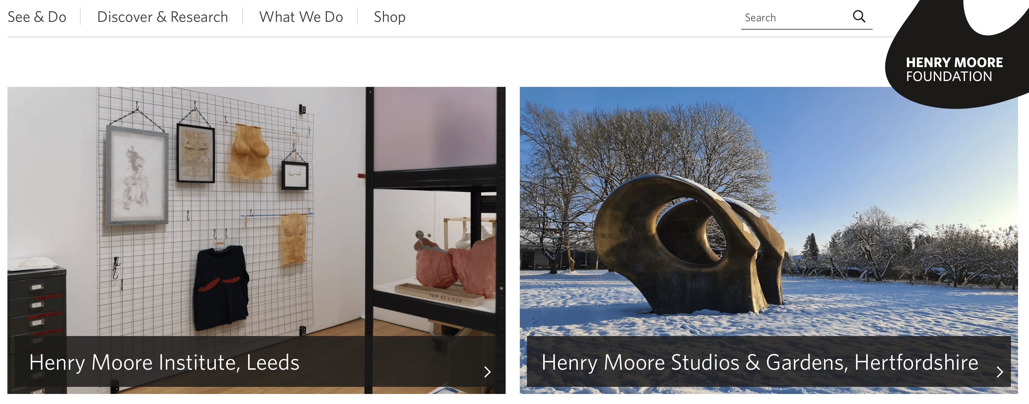
1 - Simple header navigation / Content and navigation
The work of HMF is broad and very different across the two venues (a contemporary gallery at the Institute in Leeds and the Studios and Gardens in Hertfordshire which houses the Henry Moore collection). But it was important to communicate a unified organisation, working towards a common goal. The foundation was set up by Henry Moore in the late 1970’s to encourage public appreciation of the arts. Deepening our understanding of both user needs and the vision of Henry Moore during the discovery phase helped guide our approach to navigation.
Working from a user-centred perspective, we distilled HMF’s vast offering into 3 core headings: See & Do - shows the events and offerings across the two venues and online Discover & Research - an online content hub to learn about Henry Moore, his work and sculpture more broadly What We Do - a place to understand the full breadth of work of the foundation

This radically different approach to navigation ditched the use of department names (Archives, Grants, Collections) in favour of the types of activities users were coming to the site to do - placing user needs at the heart of the new sitemap.

Rather than create three siloes of content, it was really important to ensure that there were cohesive and logical linking points between the different sections of the site. We knew that there was often crossover between these different user journeys. For example, educational visits to both venues can be found through the ‘See & Do’ section, but are also signposted from educational resources in the ‘Discover & Research’ section. This joined-up approach has increased the discoverability of the full breadth of activity on offer.
Henry Moore was a strong advocate for access to the arts. For us, that meant using language and labels across the site that are easy to understand by as wide an audience as possible. We advocated for the team at HMF to make sure that entry points into content were as clear as possible. For example, the term ‘Catalogue raisonné’ now has an entry point label of ‘Cataloguing Henry Moore’s work’.
2 - Seeded the site with entry points to browse the collection
We have created multiple touchpoints across the new site that introduce the vast and free-to-access collection to users of the main site.
1. We have built a search tool that can be added to any page of the website, in any position to encourage users to search the collection (which is hosted on the Gallery Systems eMuseum subdomain) directly from the main site. You can see this in action on the Cataloguing Henry Moore’s work and image licensing pages. We do this by passing the submitted search term to a redirect that seamlessly lands users on the search results page of the eMuseum site. This exposes users to the collection online, encouraging more traffic to the collection site to folks who may otherwise not have known it was there.
We also worked with Gallery Systems to make sure that the main site’s new header and styling is carried across to the eMuseum platform, providing consistency for the user to ensure they still feel within the ‘HMF experience’ as they transition between subdomains. With simple messaging and styling, the team at HMF can now use these collection search components to signpost the collection in relevant content/editorial stories on the marketing site.
2. There were two features from the legacy site that HMF wanted to carry over to the new site - a timeline of Henry Moore’s life and work, and an interactive map that charts locations across the globe where Henry Moore’s work can be viewed in public. These provided two more opportunities for us to provide entry points to the online catalogue and surface collection items to main website users, who may otherwise not visit the catalogue site.
For the timeline, we configured a tool that lets HMF display a broad spectrum of photos from the collection (which can be opened in a lightbox to allow up close and personal viewing) and link back to the eMuseum site for folks to take a deeper dive, request image licences or conduct academic research.

For the world map - HMF had a custom-built map in their old Content Management System (CMS) in which they had loaded hundreds of sculptures and artworks, each with their own profile containing information, an image and longitude/latitude position. To avoid an arduous manual replication of this (which would have required extensive resource from the HMF team) we took this existing data and imported each of these profiles into the new site, employing a brand new custom map functionality that uses Google Map user interface.
Wherever users are, they can now explore the global reach of the collection by simply navigating around the map and interacting with pins to view the location and a preview of hundreds of sculptures. They then have the opportunity to continue their journey in two ways - either into the eMuseum site for further details on each artwork, or to the variety of worldwide partner venues hosting the sculptures.

3 - Better use of HMF’s visual identity
To make better use of HMF’s visual identity and help it reach its potential in the digital space, we improved the brand elements available to the marketing team. This involved simple applications like incorporating the correct typeface, alongside more complex things like using the logomark as a mask for featured imagery.

HMF’s original brand guidelines suggested using colours that reflected those in the sculptures synonymous with Henry Moore’s name. But these were fairly dark colours made up of browns and beiges, which tend to be less engaging on digital applications. So together with HMF we devised a new palette of brand colours that were bright, vibrant and more complimentary to the artwork, creating a flexible system that feels more inviting to the user.
“The result is a new website that positions us as relevant, interesting, open, demonstrates our expertise and provides a sense of narrative. We also think it is exceptionally fine and good looking! We are excited about where we can go from here; we’re already talking to Substrakt about next steps and the new features to explore”.
Emily Dodgson, Head of Marketing and Communications at HMF.
From our perspective, what’s made this project so great is seeing the combined impact of all the changes we’ve made. There’s not been one specific thing that characterises the work, or a major development solution that we’re shouting about. It’s been about working collaboratively with the HMF team to make seemingly smaller improvements across different areas, creating a new website that does HMF”s offering justice while providing an easy and enjoyable user experience.
If you’d like to hear more about anything we’ve talked about here just get in touch, we’re always happy to have a chat: team@substrakt.com